


Every beautiful painting, photograph, picture, or whatever goes on a canvas has one thing in common. And that’s COMPOSITION.
Composition is the key to make an average render look like a professional one. Composition is what sets the professionals apart from the average joes.
And composition is not difficult. In this blog post, we will learn 5 great Interior composition tips for Rendering and Photography to take your renderings to the next level.
Let’s get started !
1. Rule Of Thirds | Photography composition tip
The Rule of Thirds is by far the best composition technique to improve a landscape rendering.
In Rule of Third we divide our image into nine equal squares with 2 horizontal and 2 vertical lines spanning across the image.
While composing your image think about the most important subject or element that may need to be in focus.
And then try to position the subjects at the intersection points of the two lines. It doesn’t need to be precisely on those intersection points but try to keep it as near to the lines as possible.

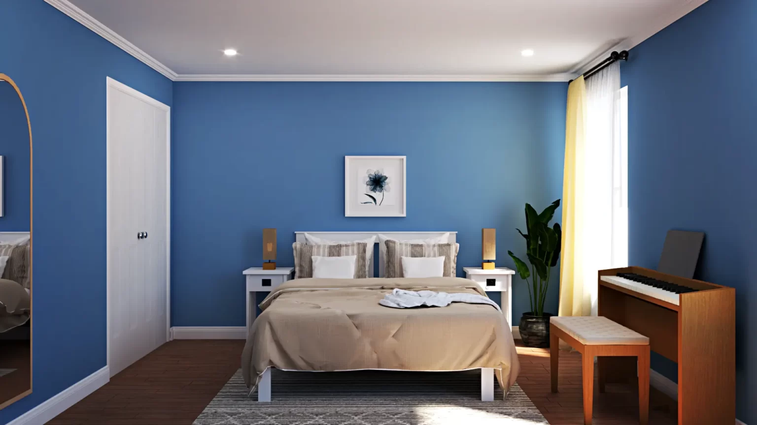
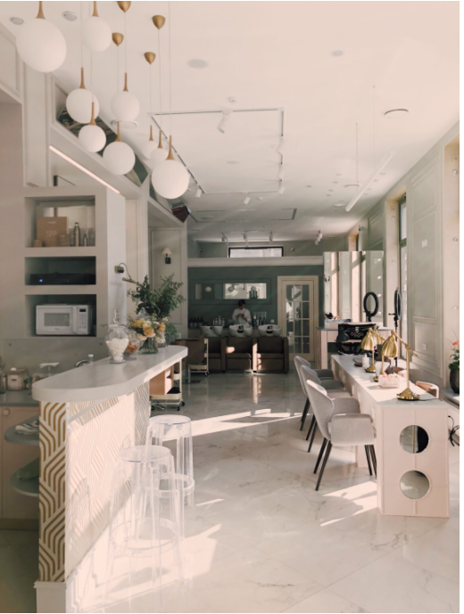
Here are few tips to follow the Rules of Thirds for Interior Renders :
- Don’t take the rule of thirds too literally. It is not necessary to fill all four intersection points. We can also have either one or two objects being placed close to the intersection points.
- In the above image, you can notice that the chair is the main focal point placed at the bottom left intersection point.
- The circular table is also a focal object but is not placed exactly at the intersection point which is perfectly fine.
- When an object is alone in an image, the strongest position is the left-hand line. Objects can be furniture, plants, photoframes, artwork, decor and so on.
When a subject is not alone, the bottom right point is the strongest for multiple subjects and the upper left point is the weakest. Place your decor which is your Sketchup 3D Warehouse models accordingly.
2. Golden Spiral or Golden Ratio
Human brain has a tendency to look away from the centre in any frame.
If we place an object on the golden point i.e. on one third of the frame, the viewer is more attracted towards that photograph.
Golden ratio is similar to the rule of thirds or golden point.
The Golden Ratio allows for a composition that is perfectly balanced from a viewer’s perspective, creating a photograph that is most pleasing to the human eye.
The Golden Spiral is commonly used in visual design when you are looking to highlight something. Since science has shown that people will traditionally look at the center of the spiral, you will focus there.
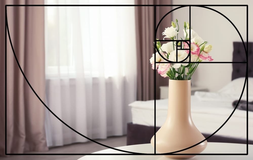
The use of the spiral is great for decor like books and movie posters. From a design perspective, looking for this proportion can help you select the right decor for your space. Finding wall hangings or posters that follow this ratio will be more appealing for walls.
In conclusion, the golden ratio helps you create a design that is balanced and appealing.
3. Symmetry
Symmetry is one of the top used photographic composition methods for interior 3D renders and interior design. The images look pristine and doesn’t distract the viewer. It’s familiar and therefor easier for our brains to process.
When we see symmetry used in interior design, we’re picking up on a familiar pattern and are able to process the individual elements of the room faster.
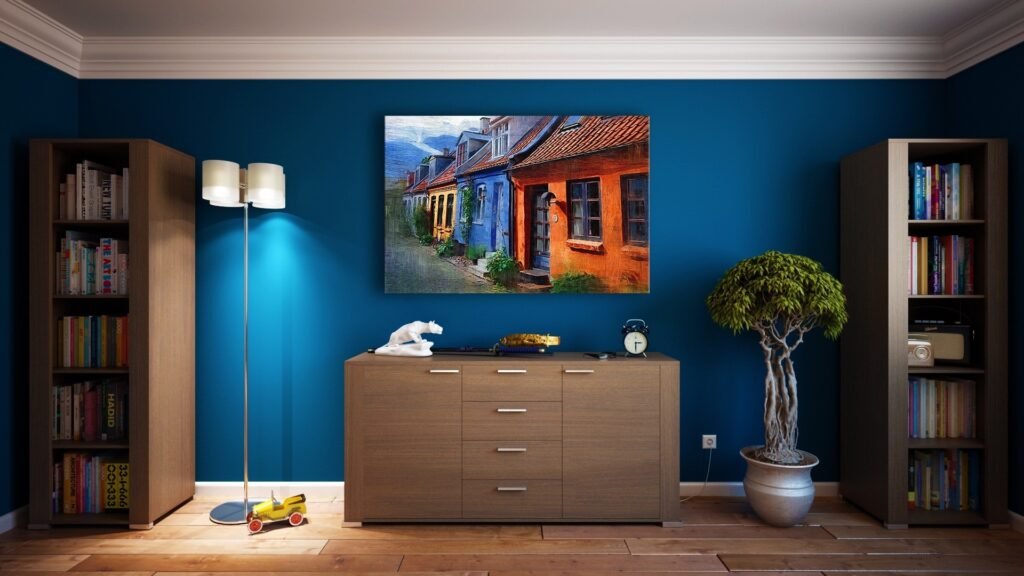
How to create Symmetry?
- Find the room’s focal point.
It should be what immediately draws the eye, and it should refer to the room’s core function.
It can be a TV unit in the living room, the bed in a master bedroom, the dining table in the dining room and so on. - Balance the weight
Bring balance to the room by placing furniture of similar weights on either side of your focal point.
These objects can be heavier like sofas flanking a fireplace or a group of lighter weight objects like matching table lamps on each night stand with a coordinated artwork above. - Don’t go for perfect symmetry
No interior space is perfectly symmetrical and stay away from homes who try to be that way (they might be crazy). Always try to rotate the second sofa a bit, move the books to the sides on a table, and try to replicate real life as much as possible.
There is no better inspiration than getting inspired by the actual spaces you live in for 3D renderings.
4. Golden Triangle
The Golden Triangle is a variant of the rule of thirds. With this type of composition, you’ll be using diagnols in your renderings. This will give your render a more dynamic feel.

How can you Compose a Render for the Golden Triangle?
Once you have your grid setup for the golden triangle composition, you’ll notice the two intersection points.
One to the right and one to the left of your composition. Like the rule of thirds, you’re aiming to put your point of interest over this point of intersection.
Renderings tend to have a point of interest, and leading lines that run through them. This is how they should be handled for the golden triangle.
- Point of Interest – This is the main subject of your photo. It can be either large furniture pieces or a group of lighter furniture objects.
- Leading Lines – The lines that leads up to the subject is now important. This is what makes your photo a golden triangle composition as opposed to the rule of thirds.
So you’re looking for a diagonal line that leads up to your main subject. This could be your flooring or even ceiling, arrangement of furniture piece, and more.
5. Diagonals
Diagonal lines work well to draw the eye of an image’s viewer through the photograph. They create points of interest as they intersect with other lines and often give images depth by suggesting perspective.
They can also add a sense of action to an image and add a dynamic looks and feel. Diagonals and Golden Triangles can be used interchangeably as they’re both dynamic
Diagonal lines are more dynamic than horizontal and vertical lines. They give you a sense of movement, of potential energy, and a sense of uncertainty.
In Conclusion
There are CG Artists and visualizers who learn these composition techniques first and then practice it on their renderings.
There are also CG Artists who build an eye for good composition through practice and learn these techniques on the fly.
You will definitely be the former after reading through this post. And you will be well on your way to create amazing looking renders for your clients by following the techniques we’ve listed above.
We hope this blog has equipped you to render more efficiently.
If you would like a detailed explanation, please do check out our premium Sketchup & Vray Course for Interior Design
Check out our other Vray blogs which you might find useful.

2 Responses
thanks it was helpful
thanks