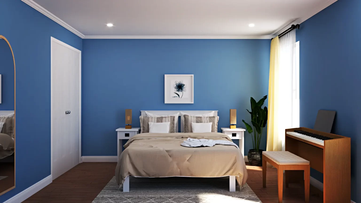
Choosing the right color scheme is an essential aspect of interior design. It can make or break the overall look and feel of a space. A well-planned and cohesive color scheme can create a harmonious and stylish space that is both visually appealing and functional. In this blog post, we will provide you with some tips and tricks on how to create a cohesive color scheme for your interior design project.

10 Tips for Designing a Harmonious Color Scheme for Your Interior Space
1. Start with a color palette
The first step in creating a cohesive color scheme is to choose a color palette. A color palette is a collection of colors that work well together and can be used to create a cohesive look. Start by selecting a dominant color that will set the tone for the room. This color will be the most prominent and will be used for larger elements such as walls, floors, and furniture. Once you have your dominant color, choose two to three accent colors that complement it. These accent colors can be used for smaller elements such as pillows, artwork, and accessories.
2. Consider contrast
Contrast is an important element of any color scheme. It creates visual interest and can make a space feel more dynamic. When choosing colors, consider the level of contrast between them. High contrast can create a bold and dramatic look, while low contrast can create a more subtle and calming atmosphere. A good rule of thumb is to choose colors that are either complementary or analogous. Complementary colors are opposite each other on the color wheel, such as blue and orange, while analogous colors are adjacent to each other, such as blue and green.
3. Think about the mood you want to create
Color can have a significant impact on the mood of a space. Warm colors such as red, orange, and yellow can create a cozy and inviting atmosphere, while cool colors such as blue and green can create a calm and relaxing environment. Think about the mood you want to create in the room and choose colors that will support that mood. If you want to create a serene and peaceful space, consider using cool colors. If you want to create a lively and energetic space, consider using warm colors.
4. Consider the style of the room
The style of the room should also influence your color choices. For example, if you are designing a modern space, you may want to choose a color palette that is minimal and monochromatic. If you are designing a traditional space, you may want to choose a color palette that is rich and warm. Consider the overall style of the room and choose colors that will complement it.
5. Use neutrals to balance the color scheme
Neutrals such as white, beige, and gray are an essential part of any color scheme. They can be used to balance out the more vibrant colors and create a cohesive look. When using neutrals, consider the undertones. For example, if you are using a warm color palette, consider using warm neutrals such as beige or cream. If you are using a cool color palette, consider using cool neutrals such as gray or white.
6. Experiment with patterns and textures
Patterns and textures can add depth and interest to a space. When using patterns and textures, consider the colors in the pattern or texture and how they relate to the overall color scheme. Choose patterns and textures that complement the colors in the room and create a cohesive look.
7. Consider the lighting
Lighting plays a crucial role in how colors appear in a space. The color of the light can affect the way colors look in the room. When selecting colors, consider the type and intensity of the light that will be used in the room. For example, warm light can make warm colors look more vibrant, while cool light can make cool colors look more subdued.
8. Use color to highlight architectural features
Color can also be used to highlight architectural features in a space. For example, painting an accent wall in a different color can draw attention to a unique architectural feature such as a fireplace or a built-in bookshelf.
9. Test the colors in the room
Before finalizing the color scheme, it is essential to test the colors in the room. Paint samples on the wall and observe how they look in different lighting conditions. This will help you determine if the colors work well together and if they create the desired mood and ambiance.
10. Be open to adjustments
Creating a cohesive color scheme is a process, and it may take some trial and error to get it right. Be open to making adjustments along the way and don’t be afraid to experiment with different colors and combinations.
Conclusion
In conclusion, creating a cohesive color scheme is an important aspect of interior design. By considering the dominant color, accent colors, contrast, mood, style, neutrals, patterns and textures, lighting, highlighting architectural features, and testing the colors in the room, you can create a color scheme that is visually appealing and harmonious.
Remember, creating a cohesive color scheme is a process, and it may take some adjustments to get it right. With a little patience and experimentation, you can create a space that is both stylish and functional.


